Wholesale Landscape Materials
Project Lead
UX/UI Designer
Wholesale Landscape Materials is a small landscaping supply company based in San Antonio, Texas. As the business continues to grow, the team has struggled to manage an increasing volume of customer inquiries. With only two office employees responsible for both phone and in-person sales, much of their time is spent answering repetitive questions. This project aims to identify user pain points and design a digital solution that reduces call volume while improving the overall customer experience.
The Brief
Research
Complete a competitive analysis to evaluate the online presence of other landscape supply companies in the area.
Identify gaps in available solutions.
Conduct benchmark studies on the current site to create a measurable baseline standard.
Test identified design issues with real users.
Perform a heuristic evaluation of the current website to uncover usability issues and areas for improvement.
Identify design problems.
The Problem
Customers visiting the Wholesale Landscape Materials website are frequently unable to find essential information such as pricing, detailed product and service descriptions, and answers to common questions. This lack of information leads to a high volume of customer calls and creates a less efficient, more frustrating user experience.
Users were unaware that clicking on images revealed more information, and when they couldn’t find what they were looking for on the site, they resorted to calling the store.
How might we improve the online experience for both new and returning customers purchasing bulk landscaping materials?
How might we help users easily find information about materials, pricing, and pickup or delivery options on the website?
How might we . . .
How might we reduce the number of phone calls to the office by improving the website’s usability and content clarity?
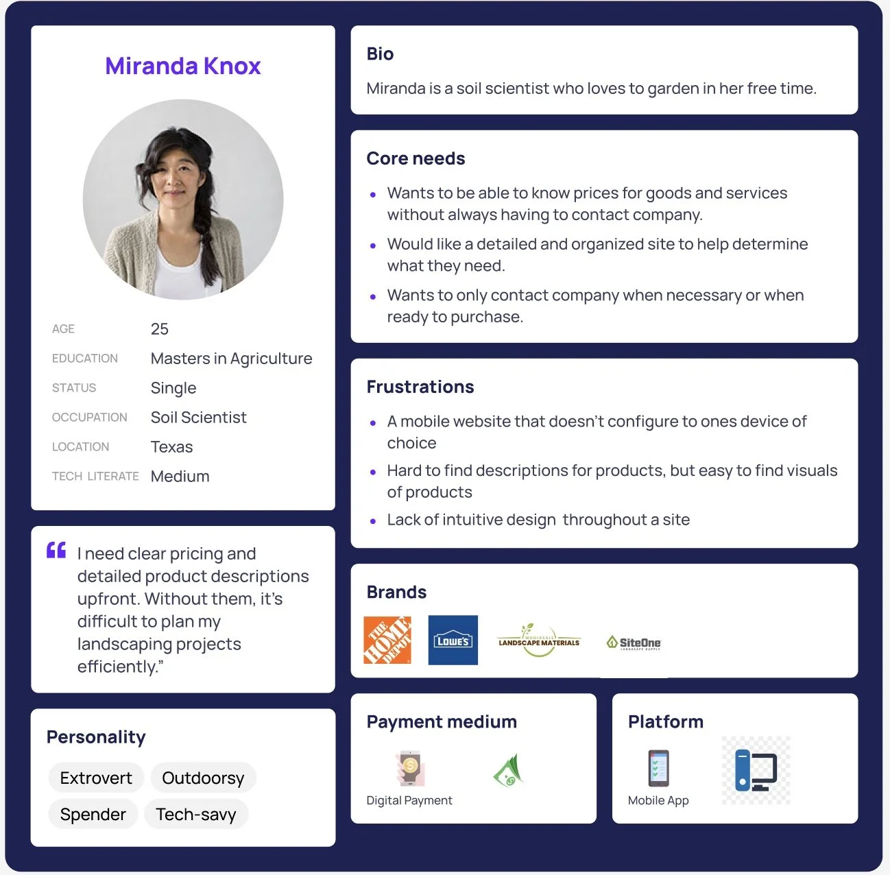
User Persona
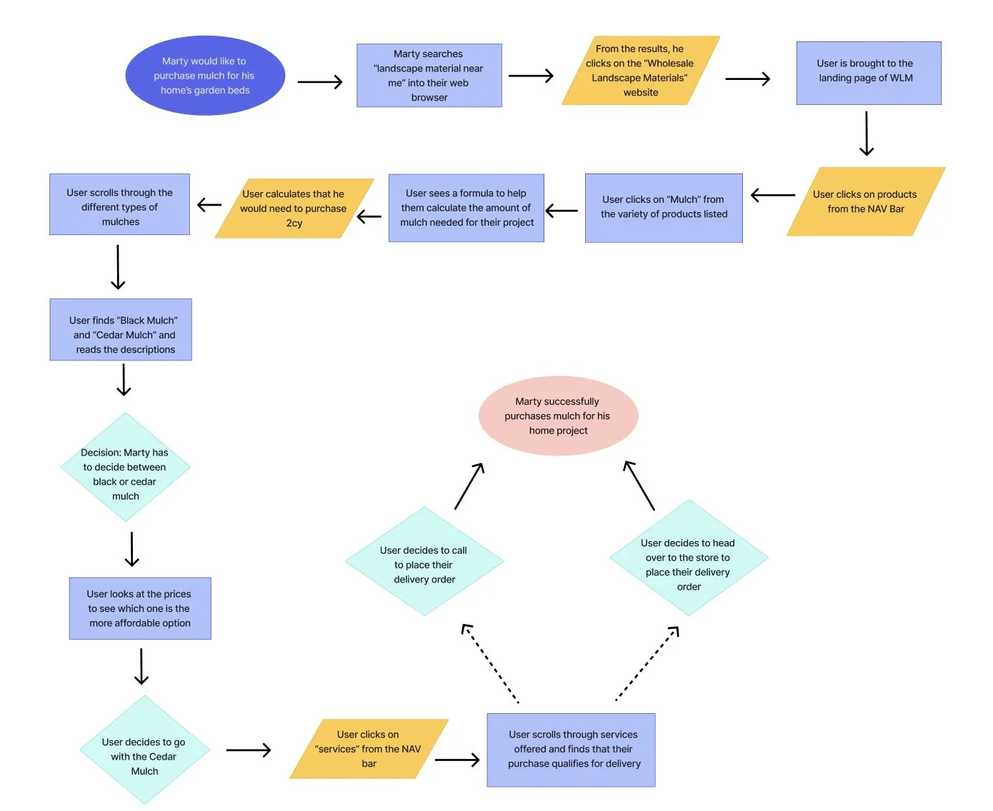
User Flow
Paper Sketches
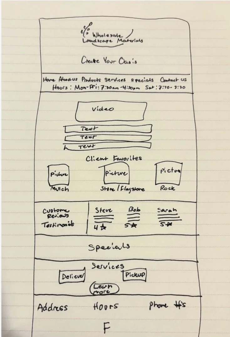
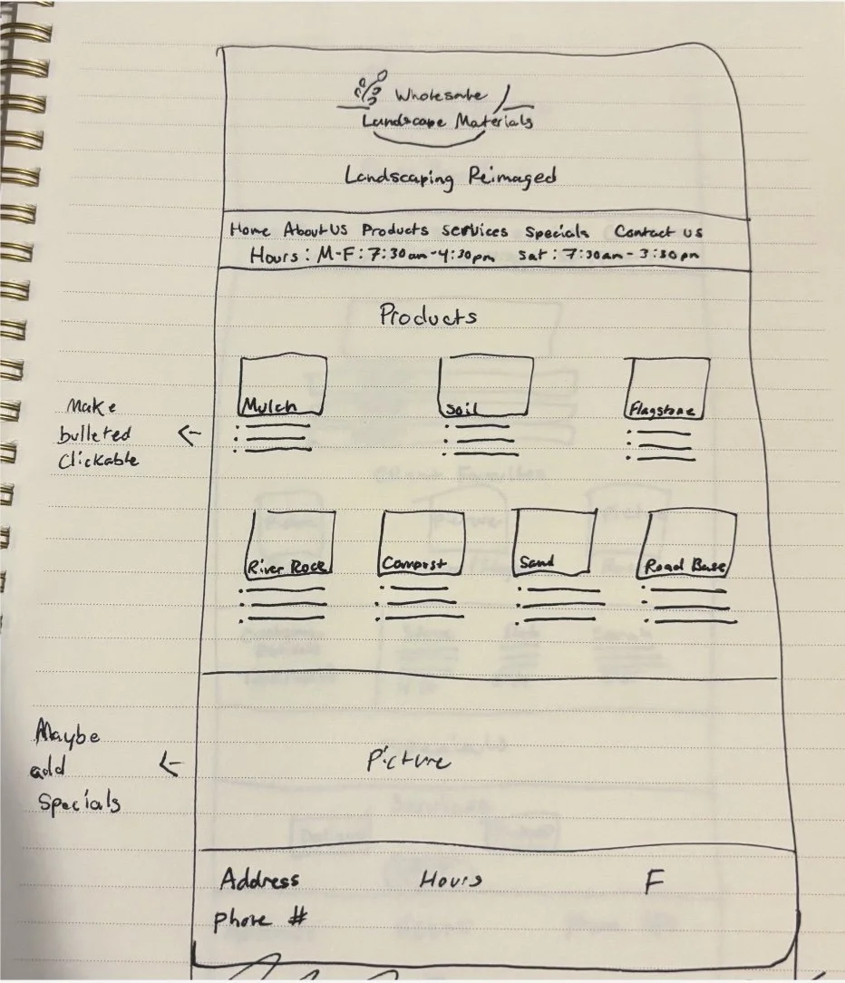
In between the paper sketch brainstorming and the low fidelity brainstorming my team and I went through a variation of ideas with the customer and employees in mind.
Solution 1:
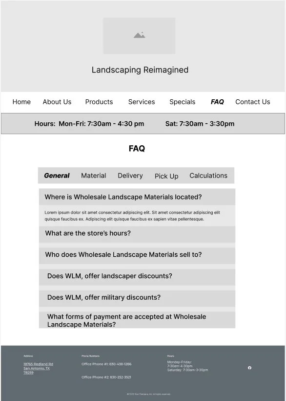
Based on insights from our comparative analysis, our team was inspired by Thomas Stone and Materials, a nearby landscaping supplier that includes a well-organized FAQ page on its site.
Create an FAQ page with the most commonly asked questions.
Solution 2:
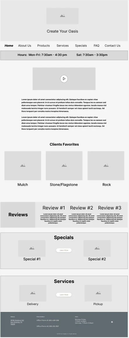
The current site lists its hours of operation only in the footer. According to employees at Wholesale Landscape Materials, this is one of the most frequently asked questions from customers. For this reason, we decided to make the hours more visible and easily accessible to help users find this information quickly.
Establish a logical hierarchy with navigation at the top, hours of operation below, and the address and phone number in the footer.
Solution 3:
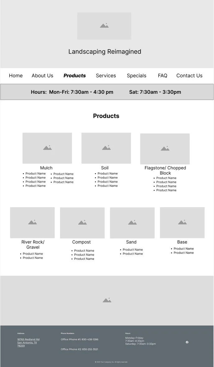
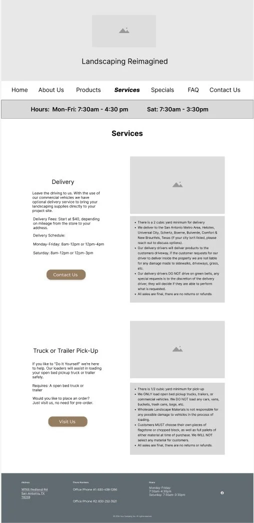
The current services page lacks organization, presenting information in a simple bullet list without a clear structure or purpose. Additionally, the product pages do not have prices listed.
Redesign the services page to minimize clutter and present information in a more digestible, user-friendly format as well as edit the product pages to include pricing.
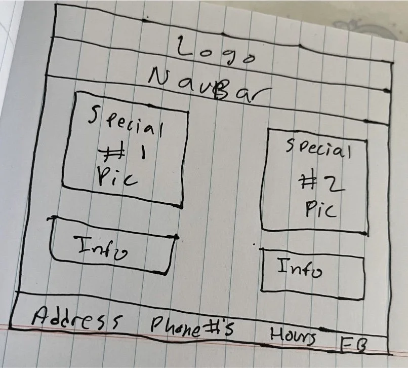
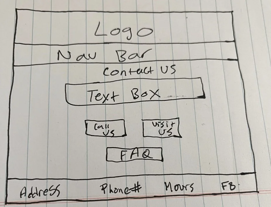
Low Fidelity Wireframes

Mid Fidelity Wireframes
To validate our design decisions, we conducted in-person user testing using a “think-aloud” approach, encouraging participants to share their thoughts and identify any features they enjoyed or struggled with.
Usability Testing
Finding One:
Compared to the benchmark tests, users in this round were able to easily identify the store hours, address, and services offered.
Finding Two:
Participants reported that the product page was easy to navigate and that displaying prices for each item was particularly helpful.
Finding Three:
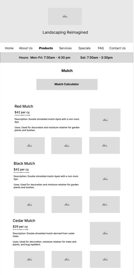
The new FAQ page received positive feedback, with users praising the clear descriptions and noting the product calculator as a great addition.
The New and Improved
Wholesale Landscape Materials
Through research, planning, management, and design, my team and I successfully redesigned the website in just three weeks. This project taught me the importance of leading a design process with intention, ensuring every step has purpose, especially under a tight timeline. We addressed key customer pain points by making information easier to find, creating a clear content hierarchy, and answering frequently asked questions. Additionally, we made the homepage more welcoming by featuring real customer reviews, refreshed the “Client Favorites” section, and reorganized the services page to ensure every piece of information served a clear purpose.
Final Thoughts
Read more of my case studies