Special Reach
Project Lead
UX/UI Designer
The Brief
"Special Reach" is a non-profit dedicated to serving families of children with developmental delays. Our team of designers aimed to create a user-friendly platform that clearly outlines program details, enrollment steps, and provides a streamlined donation process.
Research
Perform a heuristic evaluation of the current website to uncover usability issues and areas for improvement.
Identify, as designers, which features of the site can be improved or revised.
Distribute surveys to individuals who have donated or have connections to nonprofits to understand their preferences and motivations for donating.
Identify features that would improve the current website.
Conduct benchmark tests on the current site to create a measurable baseline standard.
Test identified design issues with real users.
What we found:
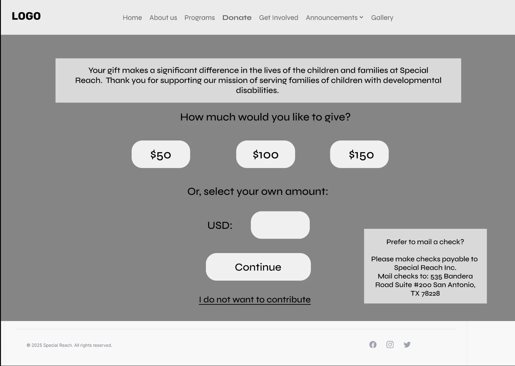
Users found the amount of donations buttons present on the site overwhelming and untrustworthy
Users pointed out how the website appeared incomplete, overloaded with information, and lacked structure.
Visitors to Special Reach’s website often feel confused and frustrated due to its poor structure, inconsistent layouts, and outdated design. The lack of cohesion makes navigation difficult and undermines trust—something especially important for a nonprofit that depends on user engagement, donations, and program enrollment.
The Problem
How might we . . .
How might we improve the website’s structure and usability to make it more effective and engaging for visitors?
How might we refresh the site’s design and visual identity to create a modern, trustworthy, and appealing user experience?
How might we expand our reach and inspire more people to get involved—whether through engagement, program participation, or donations?
Content Inventory & Audit
Steps:
Looked into the scope of the website and all it entails
Analyzed the quality of the content
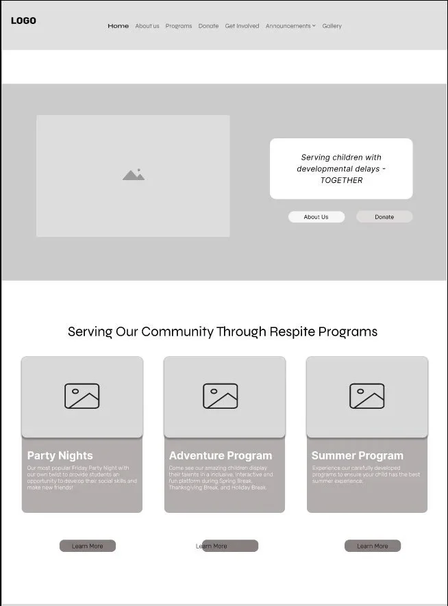
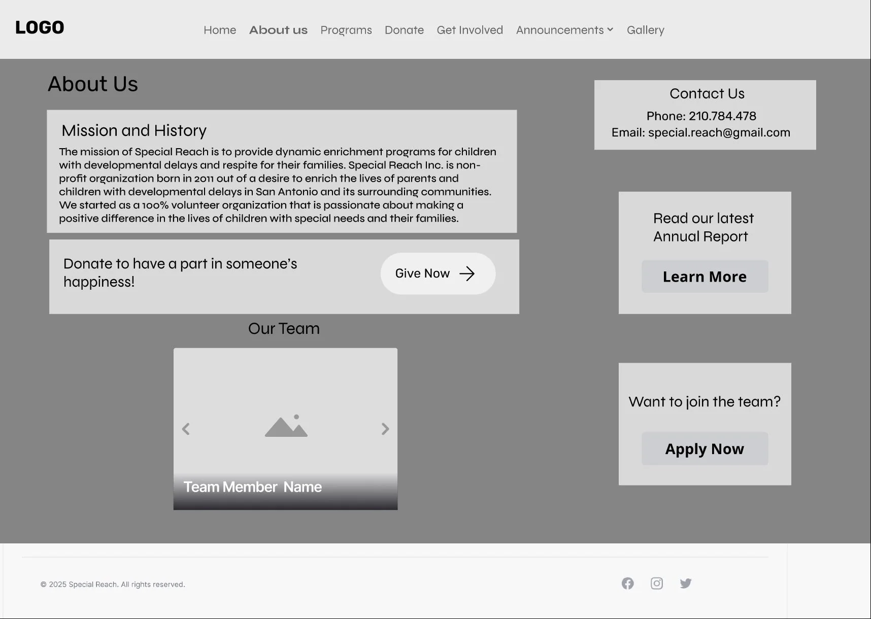
Determined that a full website redesign was necessary to improve the user experience across the seven main navigation pages
Through our content hierarchy we discovered that consolidating information across multiple pages would allow us to create a more streamlined and linear user journey.
Content Hierarchy
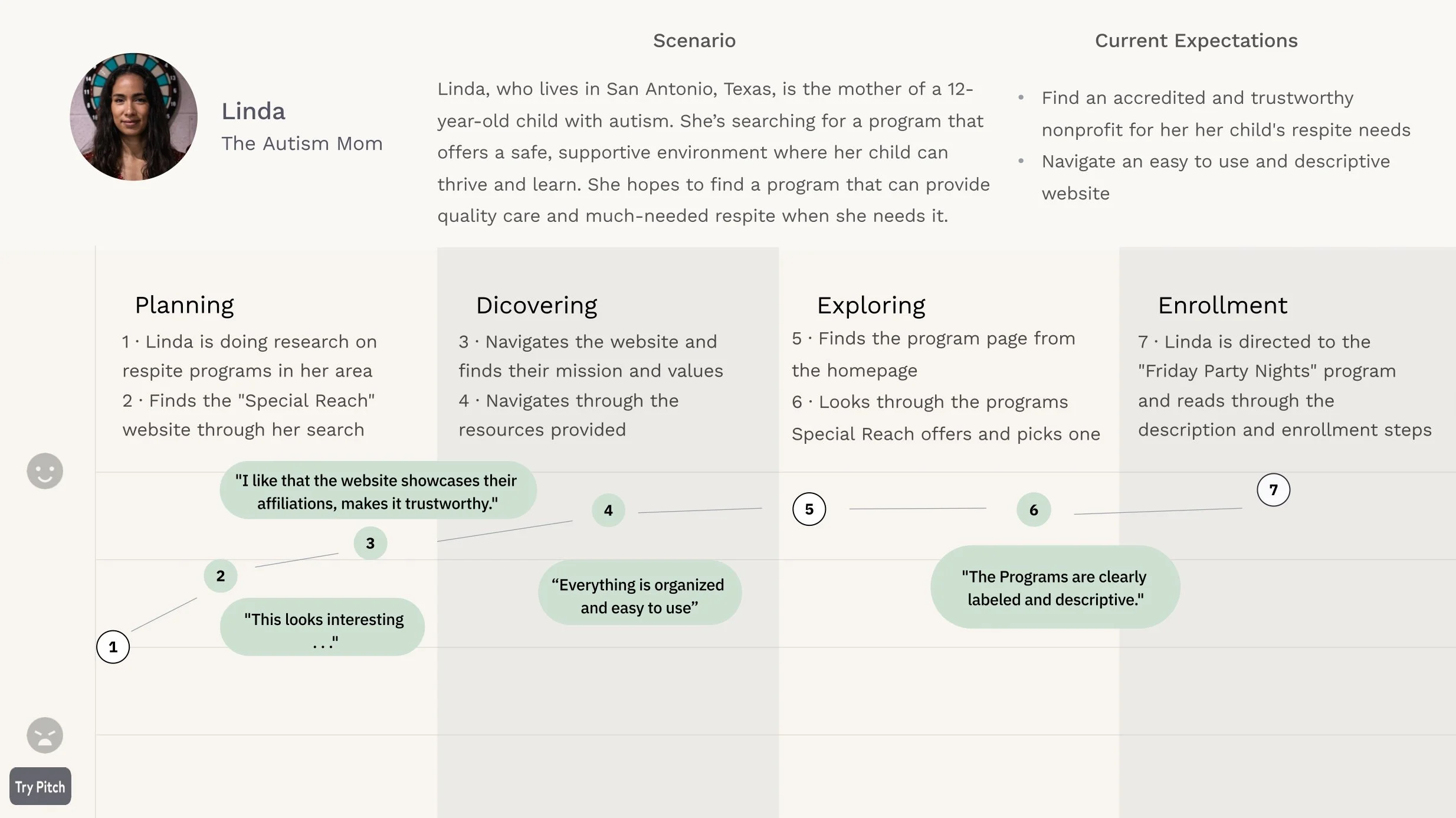
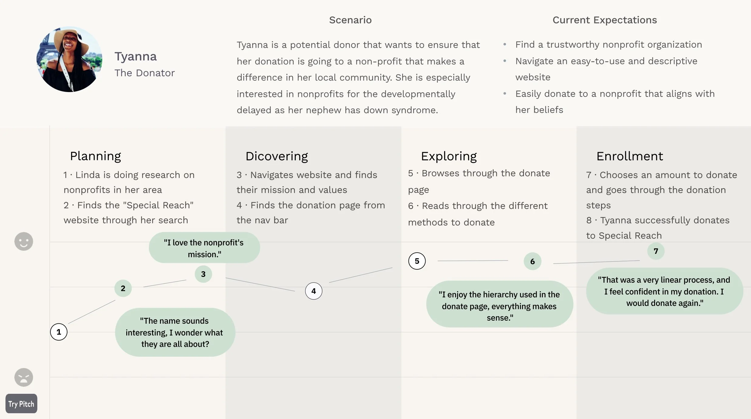
User Journey Maps
Mid Fidelity Wireframes

Usability Testing
To validate our design decisions, we conducted in-person user testing using a “think-aloud” approach, encouraging participants to share their thoughts and identify any features they enjoyed or struggled with.
Finding 1:
Participants found the donation process easy to follow and appreciated that the number of donation buttons felt balanced rather than overwhelming—unlike in the benchmark tests, where they described the buttons as excessive and pushy.
Finding 2:
Participants noted that the programs page had uneven sections and suggested to create alignment on the page.
Finding 3:
Participants liked that the overall website was easy to follow and had structure.
Brand Identity
We wanted to make sure the website was accessible and organized while keeping the fun, childlike energy of the original—just with a fresh, updated look!

Current

New
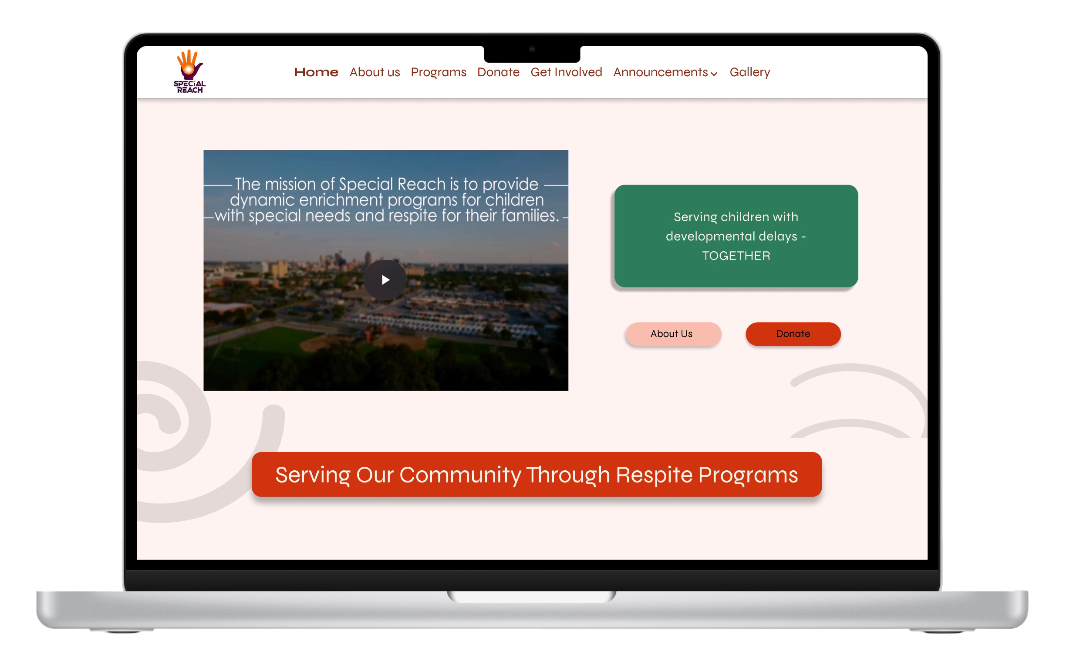
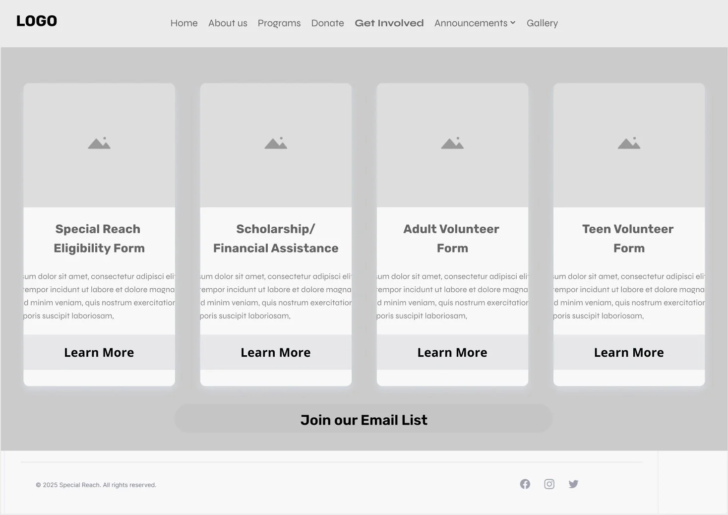
The New and Improved
Special Reach


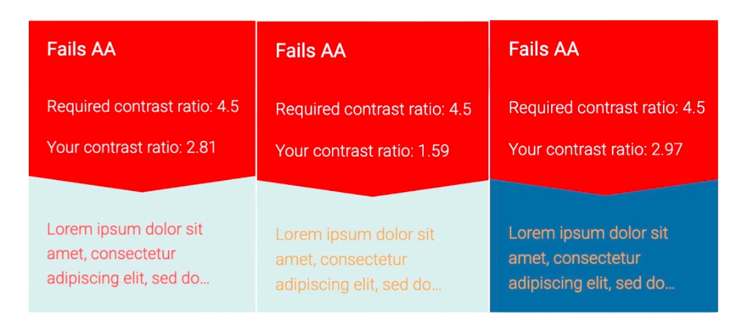
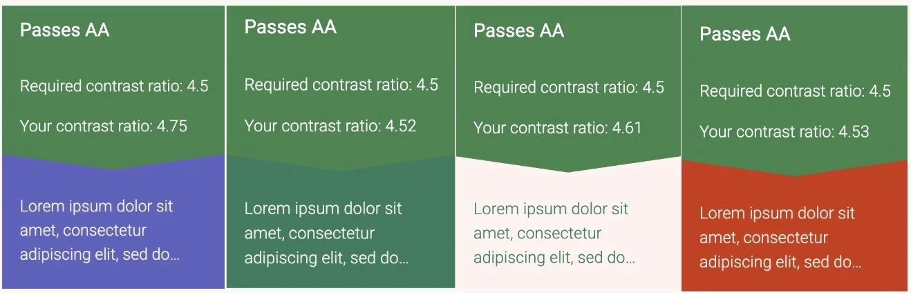
Overall, the Special Reach website redesign helped me better understand the realities of designing for both mobile and desktop. While it can be a lengthy process, seeing the design come together made it incredibly rewarding. This project also reinforced the importance of accessibility—rethinking the color palette and evaluating the typography showed just how much of an impact inclusive design can make.
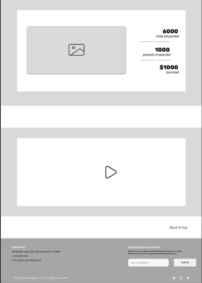
In just five weeks, our team created a consistent and intuitive flow throughout the site, improving navigation and key user pathways such as donation and program enrollment. The redesign resulted in a more cohesive and user-friendly experience, featuring a modern aesthetic and a clear visual hierarchy that enhances both usability and trust. The nonprofit’s mission is now more visible and accessible to users, allowing the site to better support engagement and impact.
Moving forward, the next steps would include collaborating with the Special Reach team to collect performance metrics and conducting additional user testing on the high-fidelity prototype to gather further insights.
Final Thoughts
Read more of my case studies